
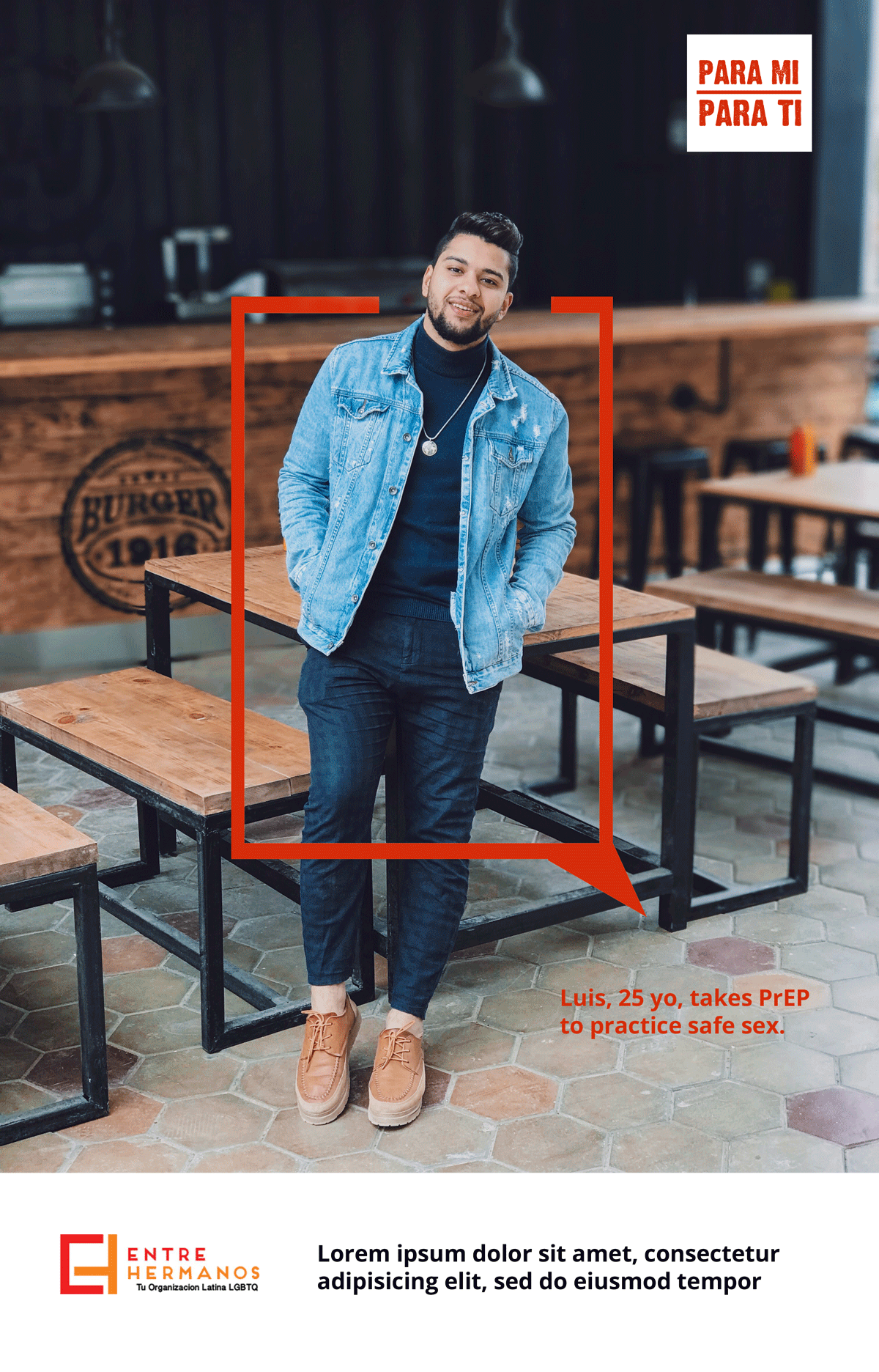
"Ambiguous" Concept:
This is a an attempt to address an Important concern coming from group feedback - being casted as "looking" homosexual. Intentional photography selection here to suggest an attractive, youthful man of any sexual orientation.
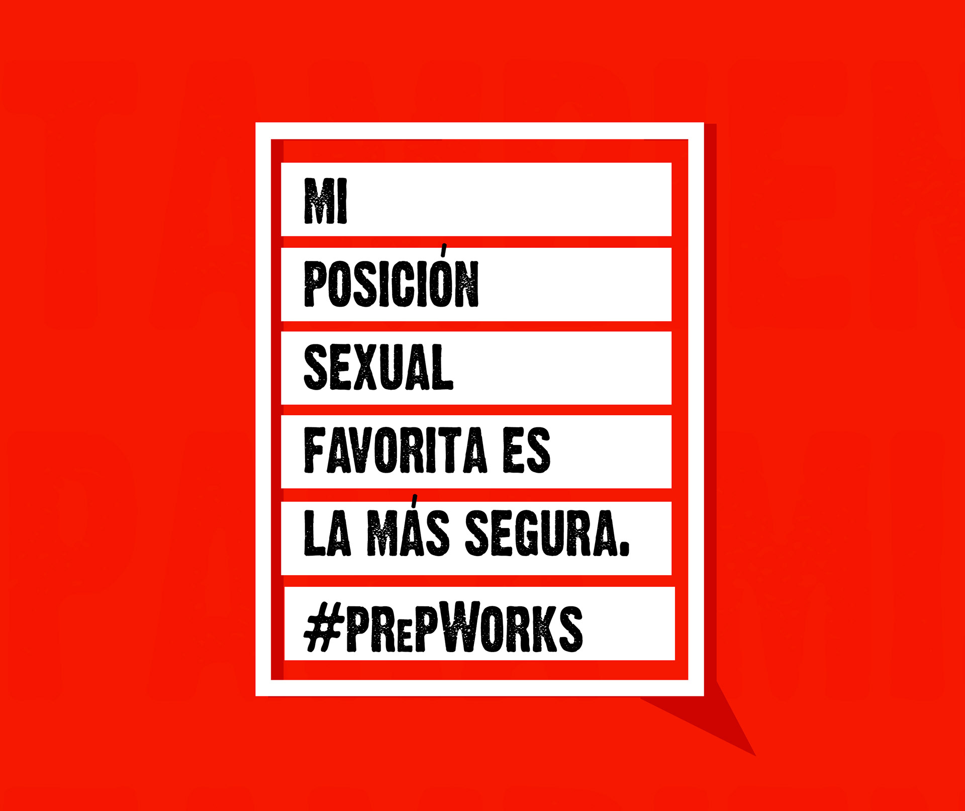
Stimulating yet simple graphic concept:
This direction promotes the simplistic safety that the pill carries, and suggested potential hashtag #Prepworks. Campaign colors started out with reds but gradually are toned down after feedback rounds. Text reads: "My favorite sexual position is the safest one. PrepWorks"
Options explored ranged between illustrations to actual photography. Influential factors that informed revision work ranged from use of popular slang in the Spanish speaking community, specific color selection or preference, and lifestyle, tone, and situational aspects.

Super Hero Concept:
This iteration was one of the two favored among the groups. The text reads: "Hey boy, take charge of your life with PreP - Be your own hero. Stay safe!" The takeaway here: lead with humor mixed with courage to protect yourself.

Puto o Listo Concept:
Again, carrying the sexually ambiguous approach, this photo was selected of a Latin-looking male with an aloof, almost unfriendly facial expression. Tagline suggests is he a: "Puto (slut, easy) or list (ready, protected)?" and subtext reading: "Emilio takes PrEP".
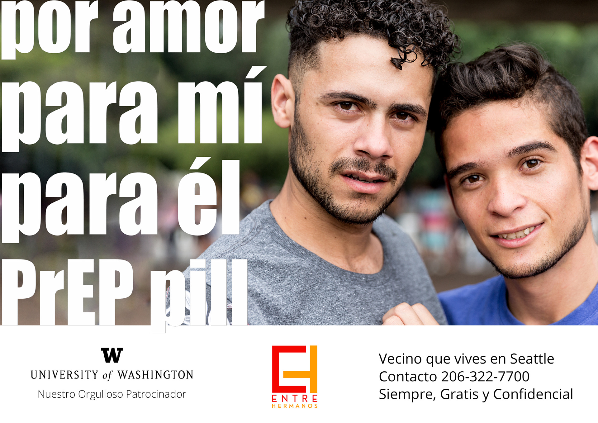
For Love Concept:
The main header reads: "For love, for me, for him, PrEP pill".
After a few other photos used - this one was the most favored among all focus groups - for the realistic, unfiltered look of the men. The words in the sub text: "Always, free and confidential" were also important to the viewers. PS: This was winning art direction that informed the paid-for campaign.

Beyond Language Concept:
An all illustrated infographic was explored to ensure that any one, regardless of language or specific Spanish dialect, even the ability to read would not be a barrier to communicate the overall message of support that the campaign can provide.